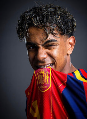
Photo via @essafirachid on X / Twitter
Chocolate brown pieces combined with yellow T-shirt
— @essafirachid View on X

Photo via @AmaraNoxVisuals on X / Twitter
Butter-yellow shirt. Wide-leg denim. Quiet luxury.
— @AmaraNoxVisuals View on X
For years the default graphic-tee blank was white, black, or heather gray. The print did the work. The body color stayed out of the way. In 2026 that assumption is loosening. Butter yellow and chocolate brown are being treated as neutrals in their own right — soft enough for everyday wear, warm enough to change how a graphic reads — and they are showing up as the base under the same intentional designs that already define the year’s best tees.
The shift is not about loud color blocking. It is about replacing the cold default with a warmer one.
Butter Yellow: The Soft Neutral of Summer 2026
Butter yellow sits between pale yellow and cream. It is not mustard, not neon, and not a costume shade. Runways from Chanel to Chloé to Calvin Klein kept returning to it; street style and celebrity wardrobes treated it the way people once treated white or beige — as something you reach for without overthinking.
On a T-shirt the effect is practical. A butter-yellow blank makes a black or dark graphic feel less stark and a tonal or soft print feel more considered. Stylists repeatedly pair the shade with oatmeal, camel, denim, and especially chocolate brown. The color acts like a neutral with a slight temperature increase: enough personality to register, not enough to fight the rest of the outfit.
Chocolate Brown: The Fall Neutral Replacing Cool Black
As summer gives way to fall, chocolate brown — sometimes framed as mocha or espresso — is doing similar work on the darker side of the palette. Designers and editors have positioned it as a warmer substitute for the cool black and gray that dominated earlier in the decade. Outerwear and tailoring lead the story, but the same logic applies to basics: a brown heavyweight or midweight tee under a graphic reads richer and less severe than pure black without losing the “serious blank” role.
Brown also completes the pair. Butter yellow and chocolate brown are repeatedly named as the season’s go-to combination. Together they form a warm axis that sits beside, rather than replaces, the classic white-black-gray set.
Why This Matters for Graphic Tees Specifically
2026’s successful graphic culture already cares about the blank: heavier cotton, boxy or relaxed fits, intentional placement. Color is the next layer of that intentionality. A tourist tee, manifesto slogan, food illustration, or modern-gothic print on butter yellow or chocolate brown does not look like a warehouse default. It looks chosen.
That does not mean every graphic belongs on every shade. High-contrast black prints often land cleanly on butter yellow. Softer or tonal graphics can sit well on brown. The point is range. The elevated blank is no longer only a matter of fabric weight and silhouette. It is also a matter of which neutral the design sits on.
How People Are Wearing Them
The simplest formula is the one already used for white and black tees: pair the colored blank with denim, wide or straight trousers, and minimal extras. Butter yellow with washed denim or cream. Chocolate brown with charcoal, olive, or the same butter yellow as a secondary piece. The graphic stays readable; the base color does the quiet work of making the whole outfit feel current rather than catalog-standard.
White, black, and gray are not disappearing. They are simply no longer the only acceptable foundations for a serious graphic tee.
Neutrals got warmer — and blanks followed
For a decade, the default graphic-tee base was white, black, or heather gray. Butter yellow and chocolate brown break that monopoly without shouting. Yellow soft enough to wear as a neutral, brown deep enough to replace harsh black — together they give designers a warm axis under the same prints people already buy.
Runway and street photos through 2026 kept pairing the two colors for a reason. Shared undertones make outfits feel intentional. On a graphic tee, that means the blank is part of the design decision, not an afterthought from the warehouse.
How to wear the shift
Try one colored blank before you rebuild a whole drawer. Butter yellow with denim or cream. Chocolate brown with charcoal or the yellow itself. Keep the graphic simple so the color can do half the work. That is the new neutral idea in practice — not a rule against white, just a wider menu.
Quick answer: Why use butter yellow or chocolate brown as a graphic-tee base?
Because white, black, and gray are no longer the only “neutral” blanks. Butter yellow and chocolate brown act as warm neutrals that make a graphic feel chosen — soft enough for everyday wear, distinct enough for 2026 feeds.
Keyword cluster
Butter yellow T-shirt, chocolate brown tee, new neutral graphic tee, warm neutral blank, color trend T-shirt base 2026.

Photo via @AmaraNoxVisuals on X / Twitter
Butter-yellow shirt editorial
— @AmaraNoxVisuals View on X

Photo via @harrysstylebook on X / Twitter
Harry Styles butter yellow Calvin Klein look
— @harrysstylebook View on X
FAQ: Butter Yellow and Chocolate Brown Graphic Tees 2026
Is butter yellow still only a summer color?
It peaked as a summer 2026 neutral but has already appeared in fall runway and wardrobe contexts in warmer, honey-adjacent versions. On tees it works year-round as a soft alternative to white or cream.
Why is chocolate brown called a “new neutral”?
It is being used the way black and cool gray were used earlier in the decade — as a default dark base for tailoring, outerwear, and basics — but with a warmer undertone that matches the current preference for less sterile palettes.
Do graphics look better on these colors than on white or black?
Not automatically better — differently intentional. A graphic on butter yellow or chocolate brown signals that the blank was chosen, not only the print. That fits the broader 2026 preference for elevated, non-default basics.
What bottoms pair best with these tees?
Denim, oatmeal or cream trousers, camel, and the opposite member of the pair (brown with yellow, yellow with brown) are the most frequently recommended. Washed black and soft olive also work.
Should every graphic tee move off white and black?
No. Classic neutrals remain essential. The opportunity is expansion: treating butter yellow and chocolate brown as legitimate graphic bases alongside the traditional set, especially when the design and the blank temperature support each other.
Can butter yellow graphic tees work in fall and winter?
Yes. Layer under chocolate brown, camel, or charcoal. The shade reads as a warm neutral rather than a strict summer pastel when paired with heavier fabrics.
Related video
Watch coverage tied to this story:
Sources and further reading
Reporting and primary references used for this article:
- Harper’s Bazaar: Butter yellow is back — summer 2026
- Who What Wear: How to wear butter yellow like the NYC fashion set
- Marie Claire: Butter yellow color trend outfits 2026
- Fort Worth Star-Telegram: Chocolate brown as fall 2026 neutral
Related reading on graphic tees and 2026 trends
Continue with these closely related stories on the same blog:
- The V-Neck Tee Is Back in 2026
- Food-Art Graphic Tees Are the Quiet Joy of 2026
- Modern Gothic and Subverted-Logo Black Tees
Author: Shivam Das